Khomane Agro was a new brand in the FMCG and agro-industries, mixing tradition with innovation. It was facing the challenge of being seen as a premium and trustworthy choice in a crowded market.


In 2022, Khomane Agro reached out to us for help with their branding strategy. We needed to understand the issues affecting their marketing. Although they offer high-quality products similar to established brands, they needed to position themselves as a reliable premium option for consumers.

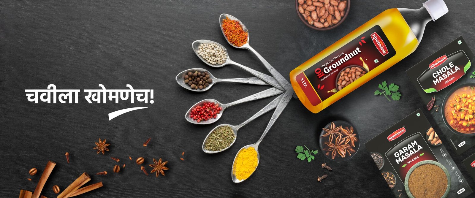
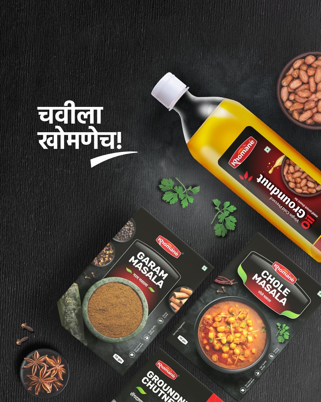
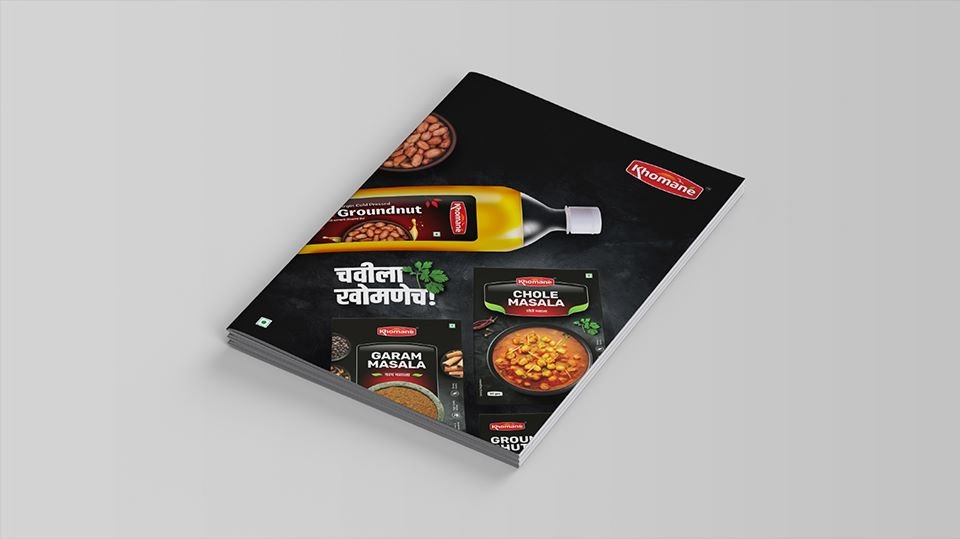
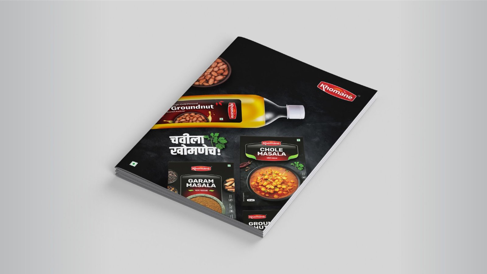
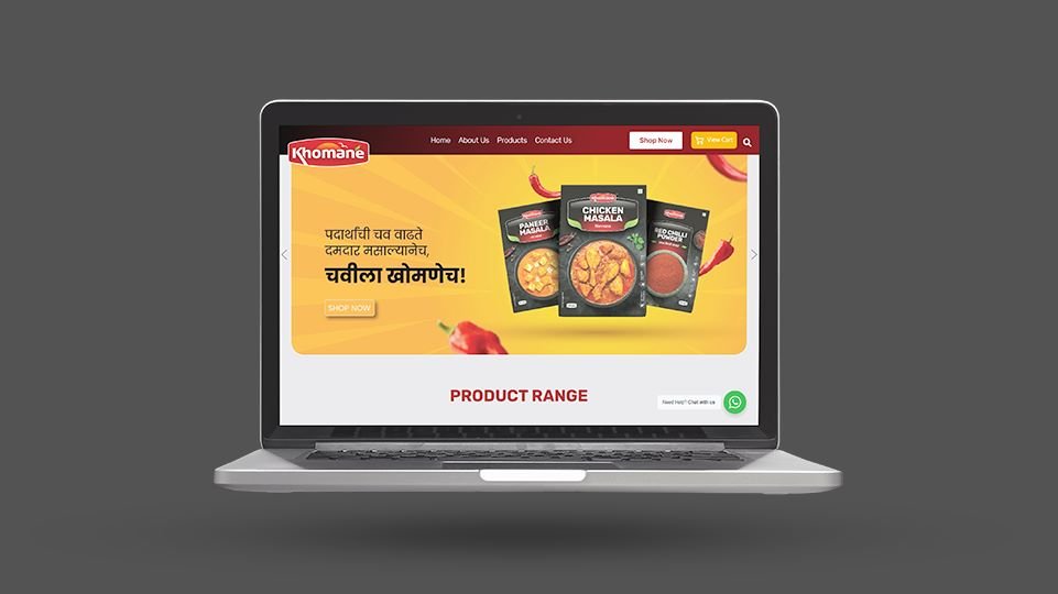
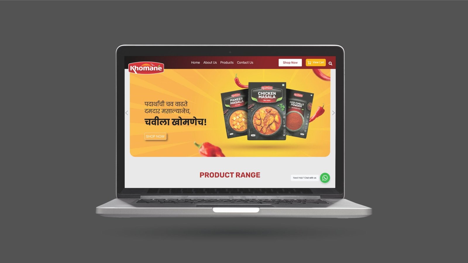
To help Khomane stand out, we created an eye-catching logo in red and designed packaging that captures attention. The logo features a rising sun, symbolizing hope and opportunity for buyers. We chose the tagline “Chavila Khomanech,” meaning “Only Khomane for Taste,” to highlight the superior taste of their products. Since our main audience is Maharashtrians, we used Marathi in all communications.
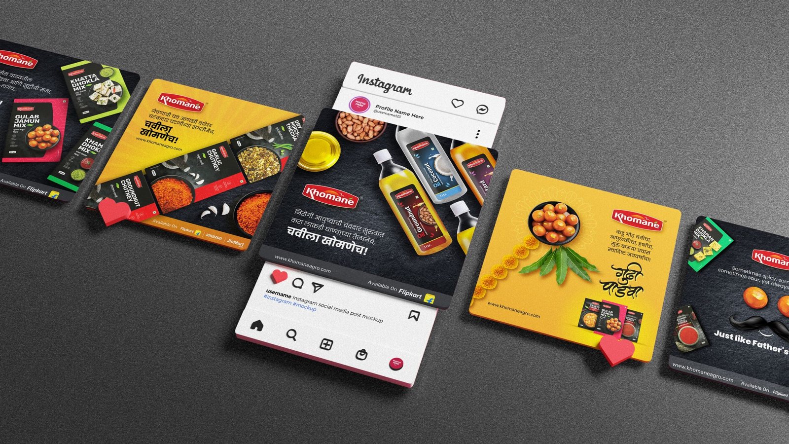
We ran a campaign using designing, product photography, digital marketing, print ads, outdoor branding, and content marketing to reach our target audiences. Our messaging consistently focused on trust and premium quality, reinforcing Khomane’s image as a leader in taste.
The branding initiative was very successful. Khomane Agro established itself as a quality food product brand known for its taste. Over a span of 3 years, the brand achieved a total turnover of ₹4 crores, showing strong market acceptance. This momentum has continued, with ongoing inquiries and sales.
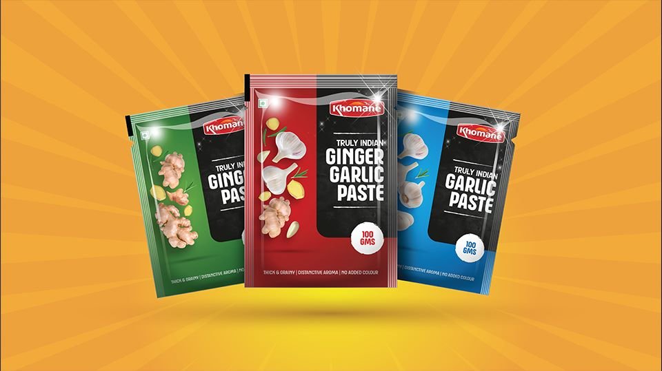
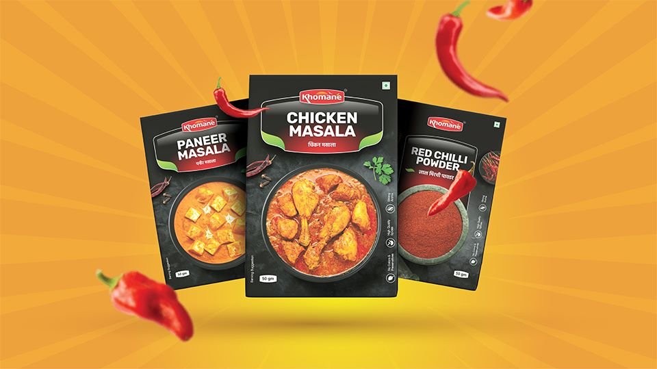
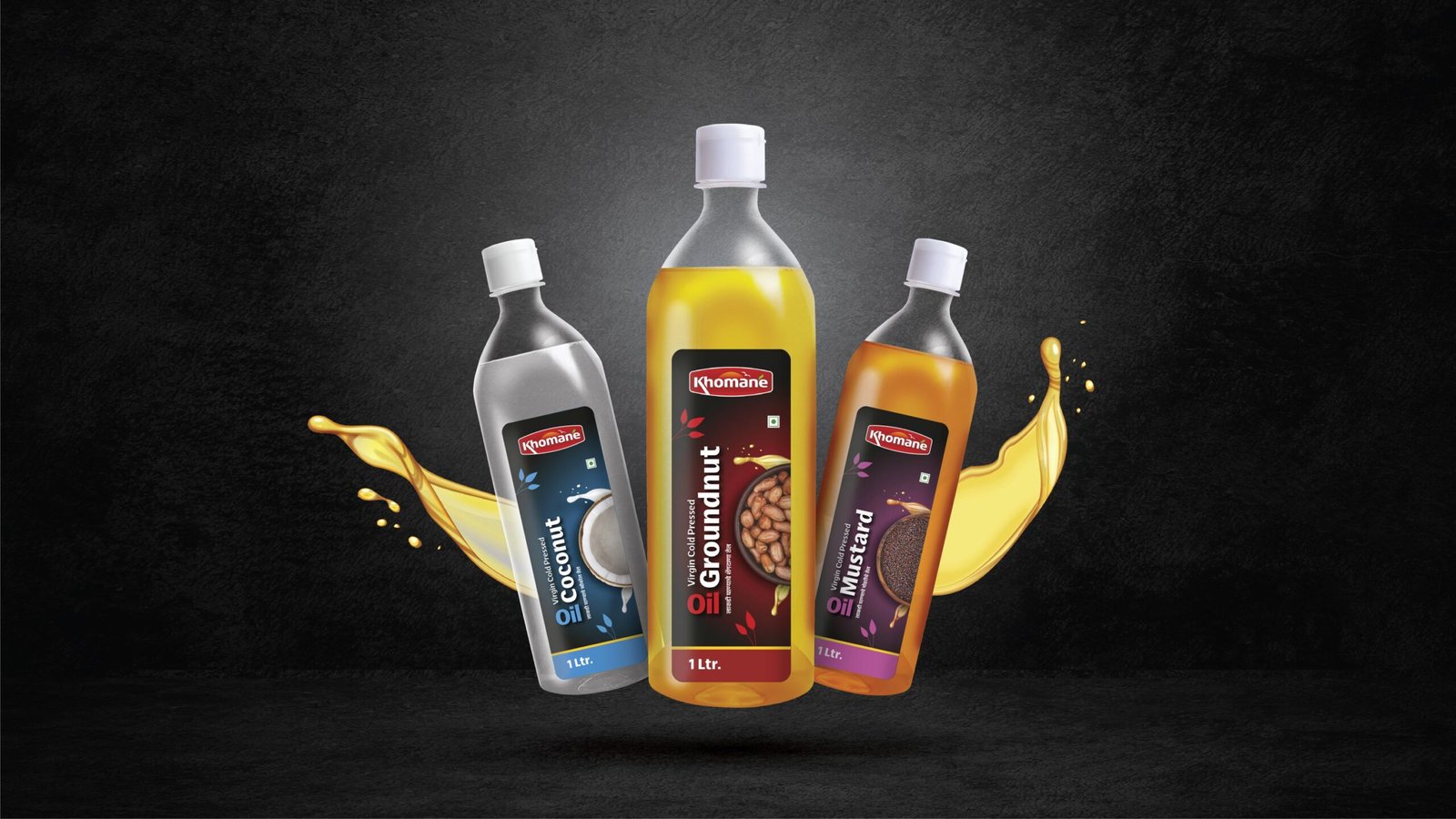
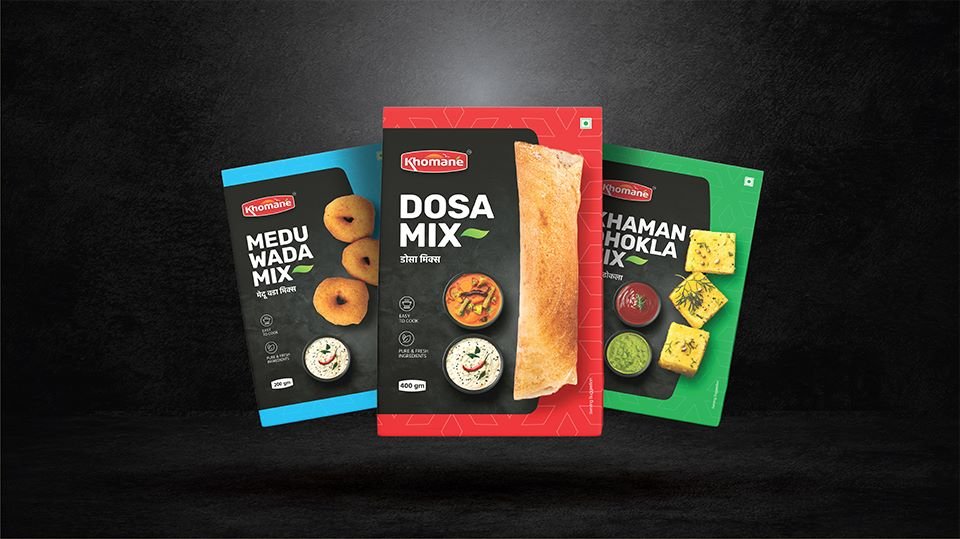
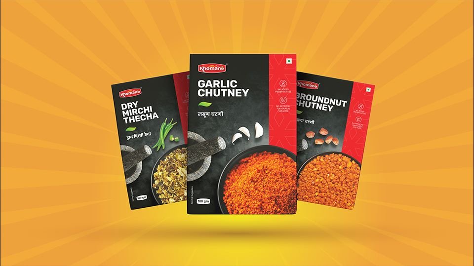
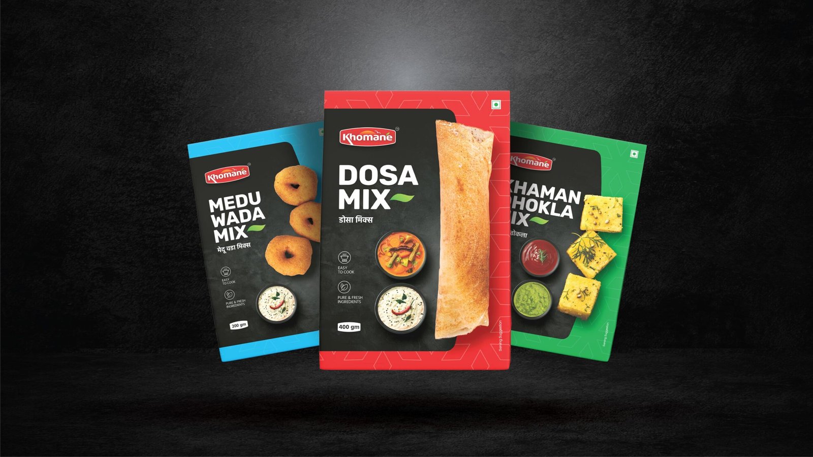
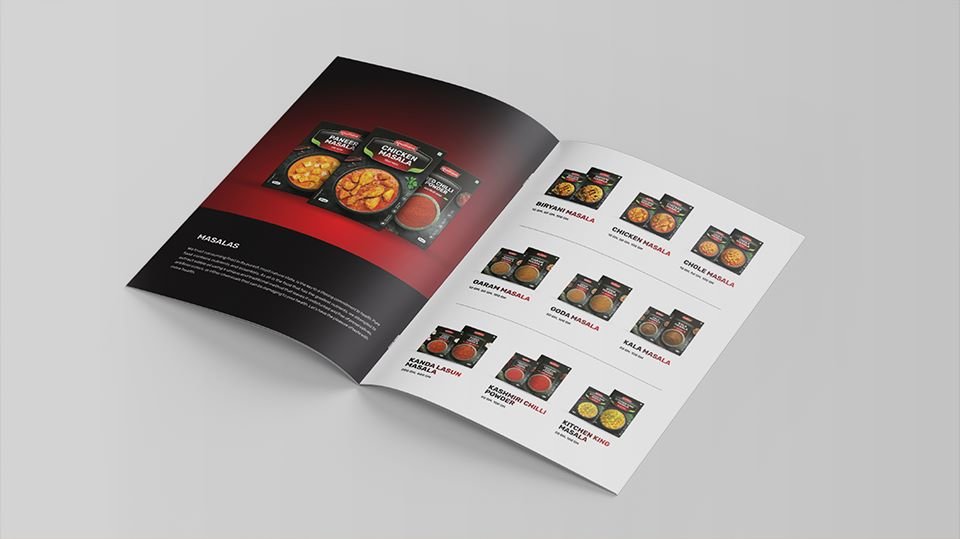
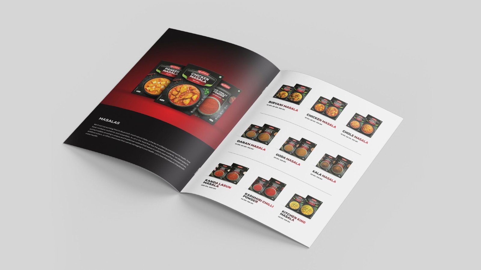
In the world of BRANDING, packaging isn’t just about containment—it’s about communication through design. For Khomane Agro products, we developed a packaging design that speaks elegance, exclusivity, and refined taste. To reinforce the brand’s high-end positioning, we recommended the use of BLACK as the primary color. The design of Khomane Agro Product has positioned them as a premium brand in the food industry. This design solution blends visual appeal with brand purpose, ensuring that every detail, from font to color, reflects the essence of a premium food experience.
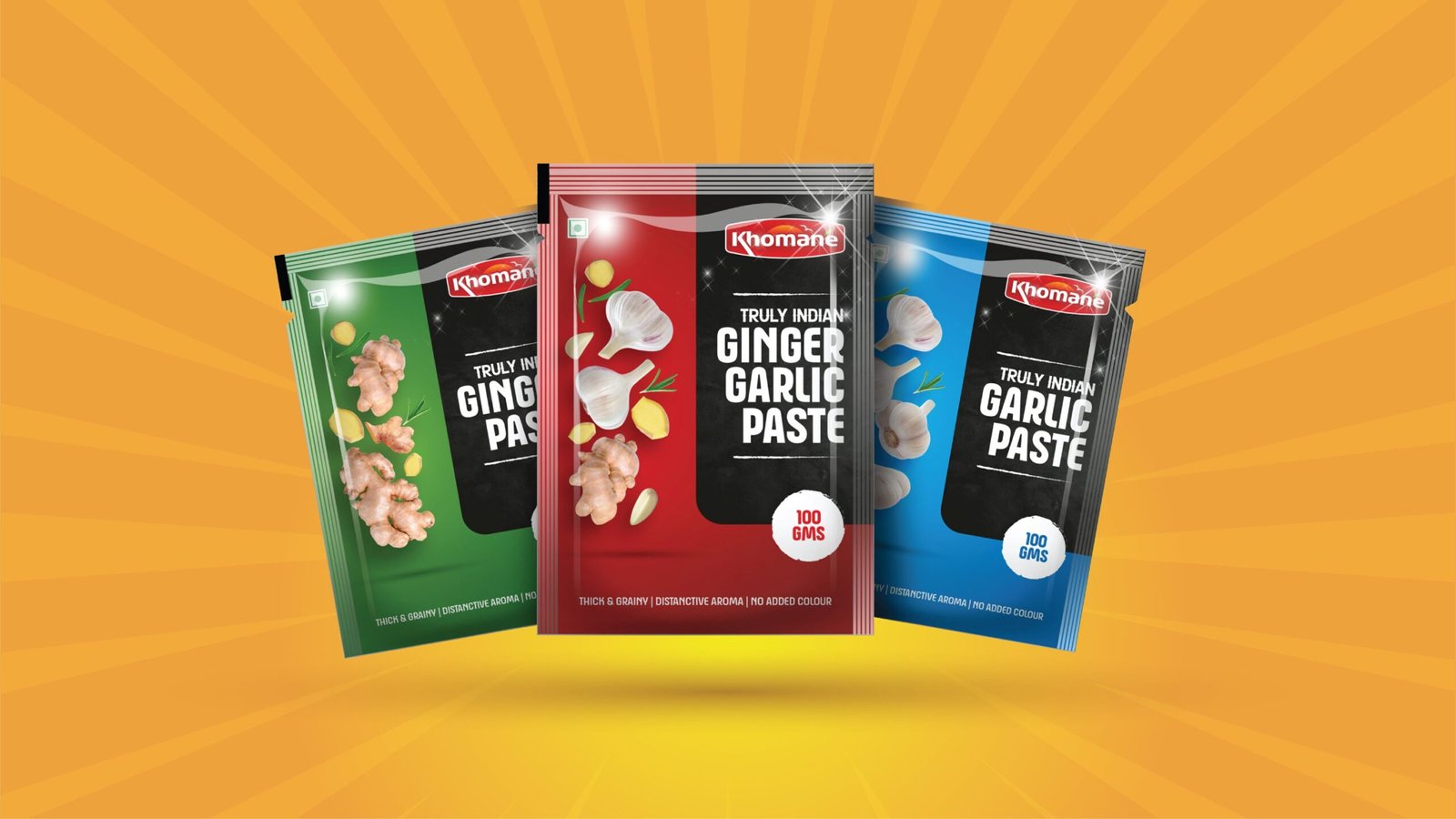
In the world of BRANDING, packaging isn’t just about containment—it’s about communication through design. For Khomane Agro products, we developed a packaging design that speaks elegance, exclusivity, and refined taste. To reinforce the brand’s high-end positioning, we recommended the use of BLACK as the primary color. The design of Khomane Agro Product has positioned them as a premium brand in the food industry. This design solution blends visual appeal with brand purpose, ensuring that every detail, from font to color, reflects the essence of a premium food experience.
The branding initiative was very successful. Khomane Agro established itself as a quality food product brand known for its taste. In its first year, the brand achieved a turnover of 4 crores over 3 years, showing strong market acceptance. This momentum has continued, with ongoing inquiries and sales.

Audio Video Production / Video Ads
For Khomane Agro, our approach to audio-video production was driven by the brand’s core values—simplicity, authenticity, and emotional connection. Known for their ready-to-cook products and flavors loved by all age groups, Khomane Agro is more than just a food brand—it’s a part of everyday memories and shared moments. We crafted a series of audio-visual ads that beautifully captured these USPs:
BrandBand Media Pvt. Ltd. is Pune’s leading branding and advertising agency dedicated to crafting impactful brand experiences.
BrandBand Media Pvt. Ltd.
Amogh Heights, Flat No.: 203, 2nd Floor Opp Yes Bank & Ruturang Society, Aranyeshwar Rd, Near TVS Shelar Showroom, Parvati, Pune 411009
info@brandbandmedia.com
Phone: +91 907 502 1409
Tel No: 020-24 46 2151
All Rights Reserved © Brandband Media Pvt. Ltd.
Privacy Policy | Terms & Conditions