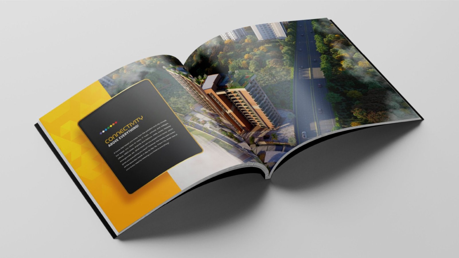
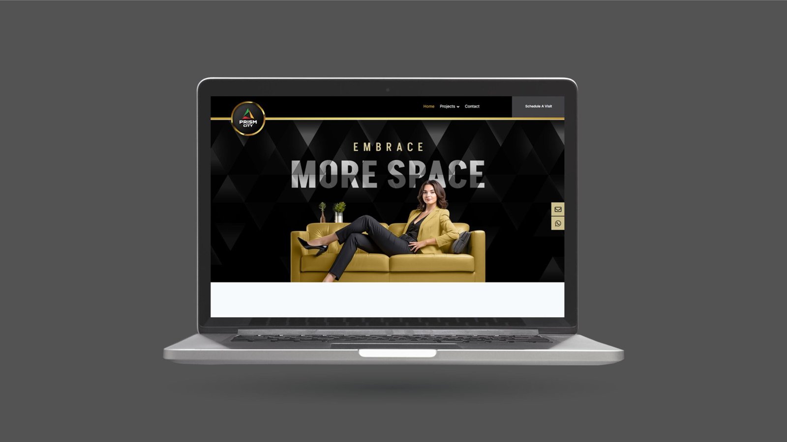
Prism City is a residential project in Charholi, PCMC, connecting key areas like Pune, Pimpri Chinchwad, and Alandi. It is spread across more than 10 acres and offers various flats, including 4BHK, 3BHK, and 2BHK. Prism City faced challenges in standing out in a competitive market and boosting flat sales.

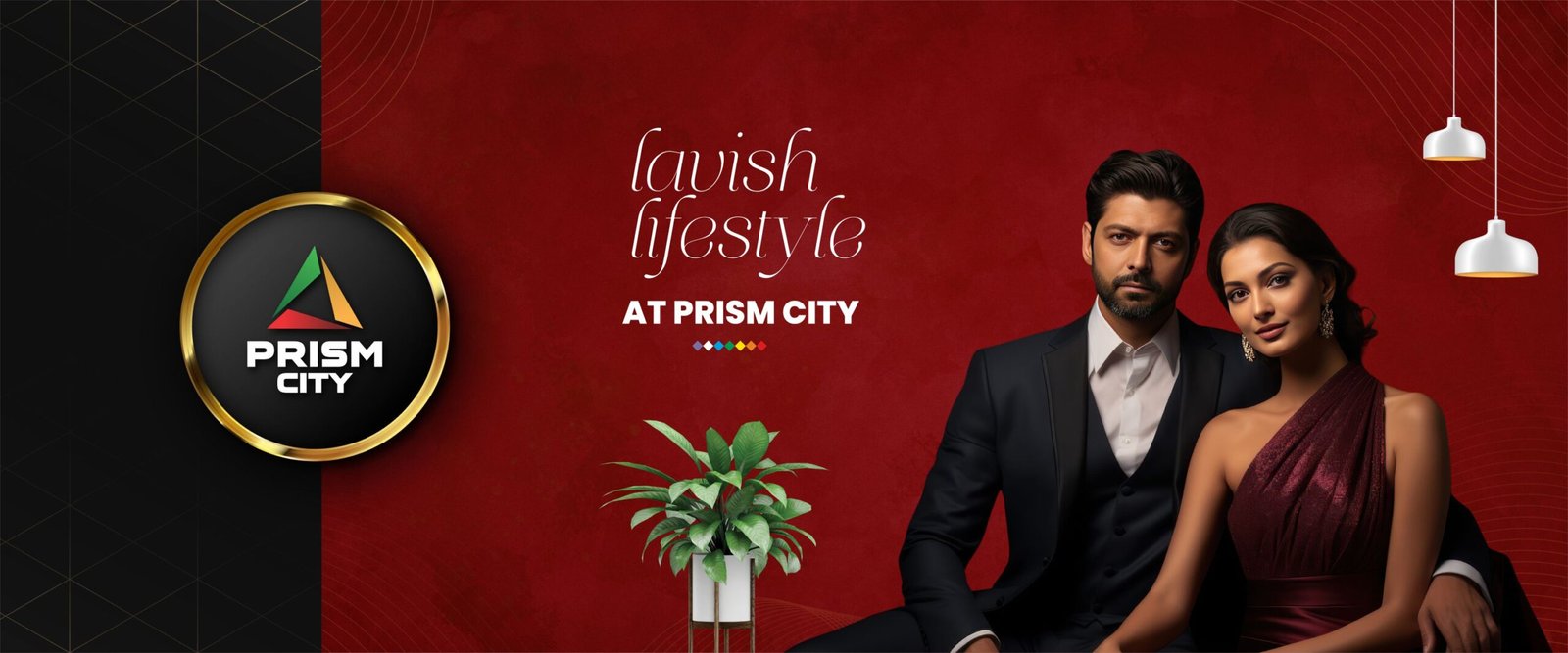
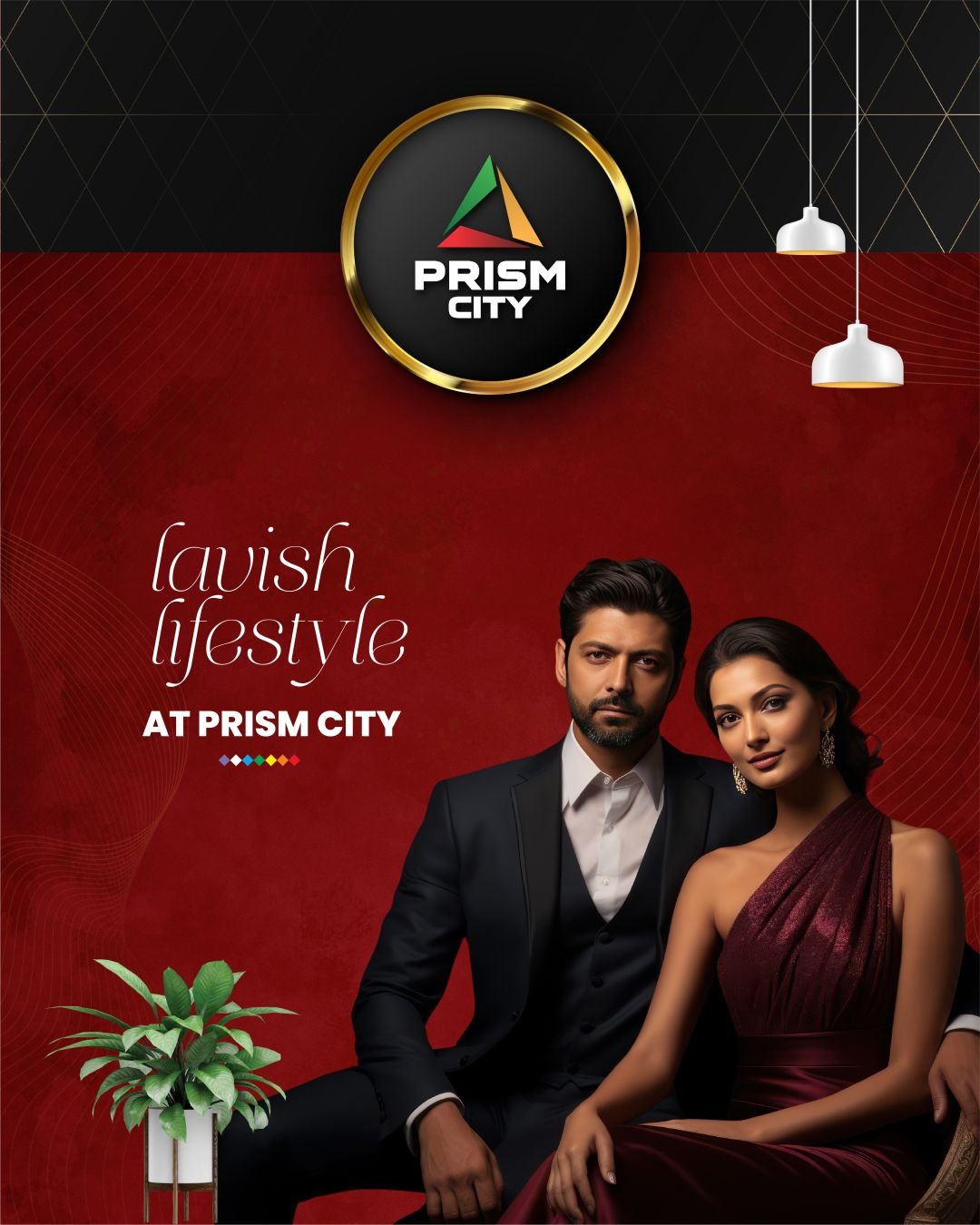
Since 2021, we have worked with the Prism City team to understand their branding challenges. Our analysis showed that homes in Prism City are larger than those in competing projects. We aimed to change how people see Prism City, promoting it as a premium choice for families wanting spacious living.

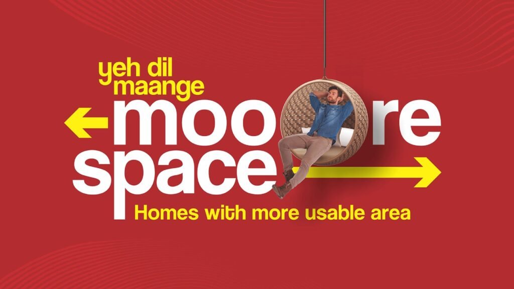
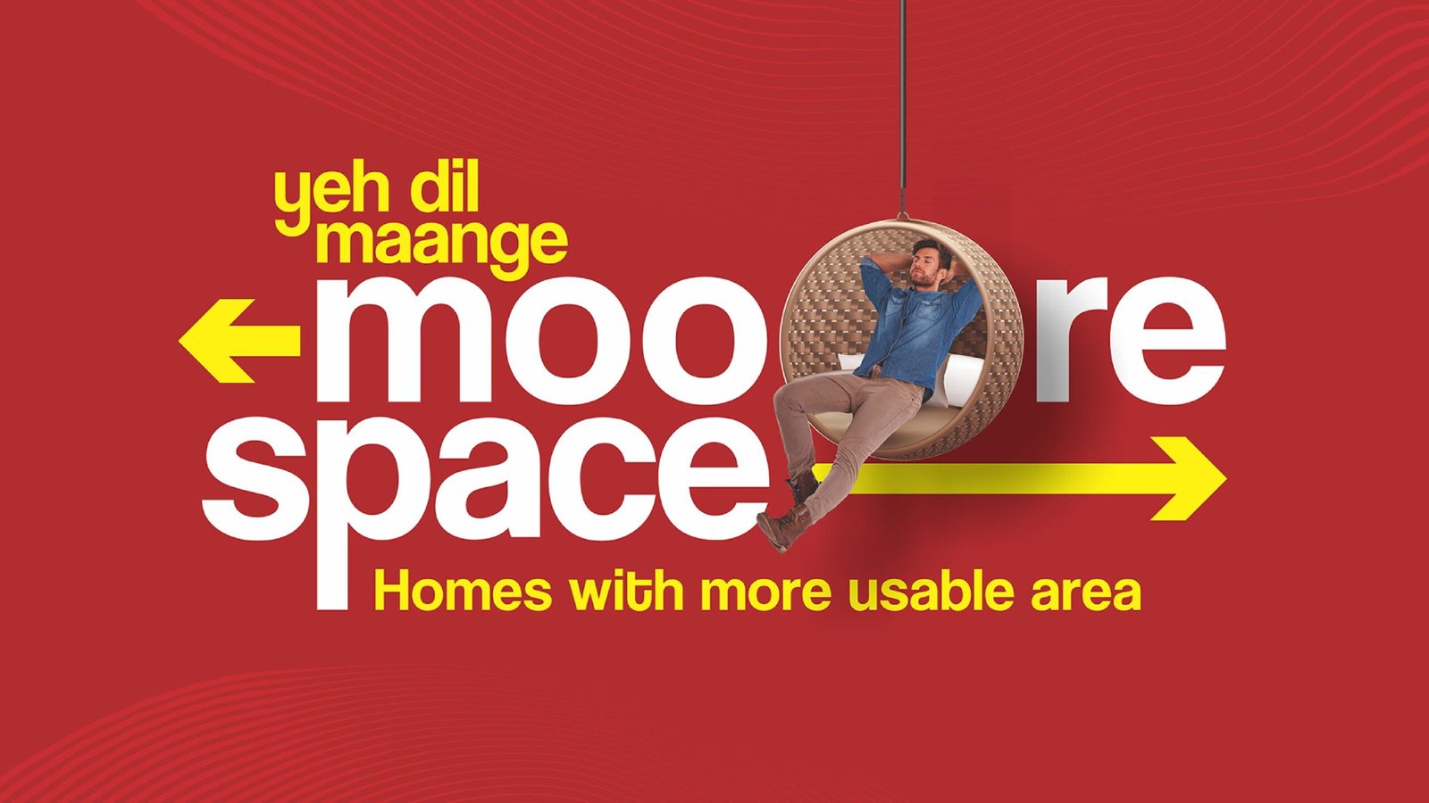
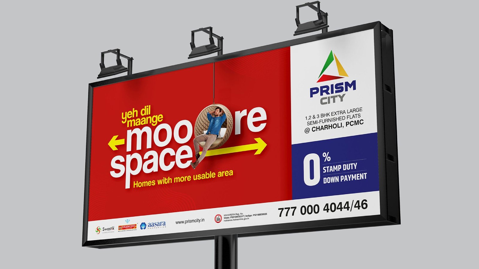
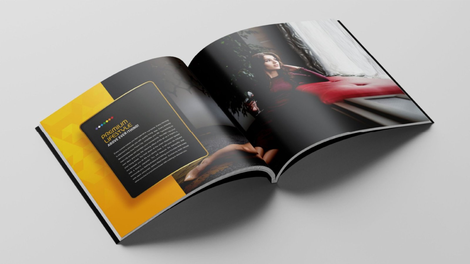
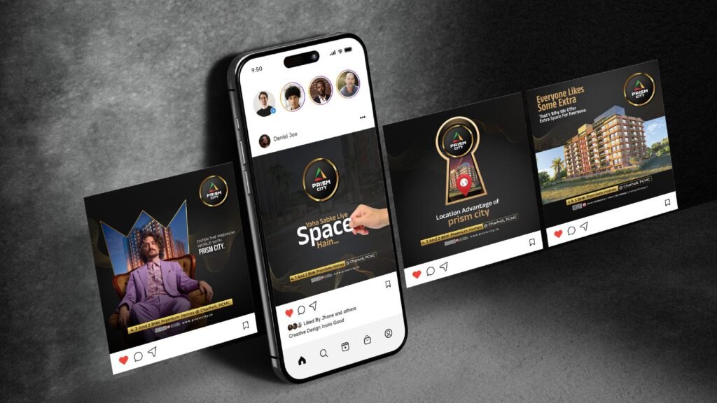
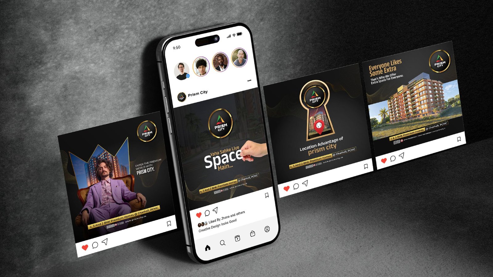
To highlight the benefits of living in Prism City, we created the tagline: “Yaha sab ke liye space hain,” meaning “Here is space for everyone.” This phrase emphasizes the large living spaces available for families, guests, and personal activities. We chose to use Hindi for our messaging since the target audience is more familiar with it than English or Marathi.
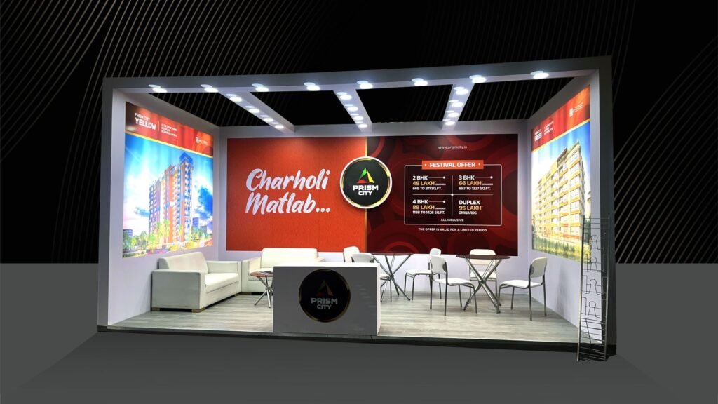
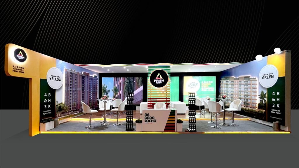
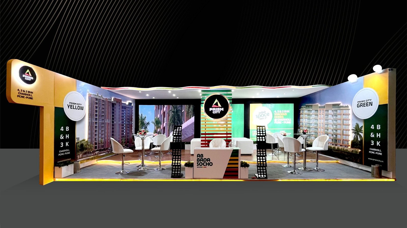
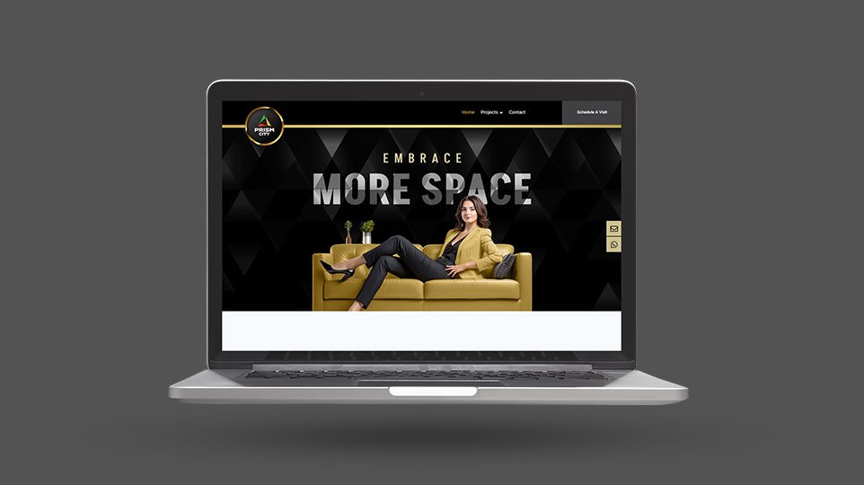
Our campaign used a mix of designing, digital marketing, print ads, outdoor branding, event branding, and content marketing to reach targeted audiences. We focused on explaining the benefits of larger homes to position Prism City as the best living space for families.
The branding campaign was very successful. Prism City established itself as a premium real estate project in Charholi, highlighting the spacious living advantage. As a result, the project recorded 27 bookings on a launch day, which is rare in real estate. This success has continued, with a steady flow of inquiries and sales.
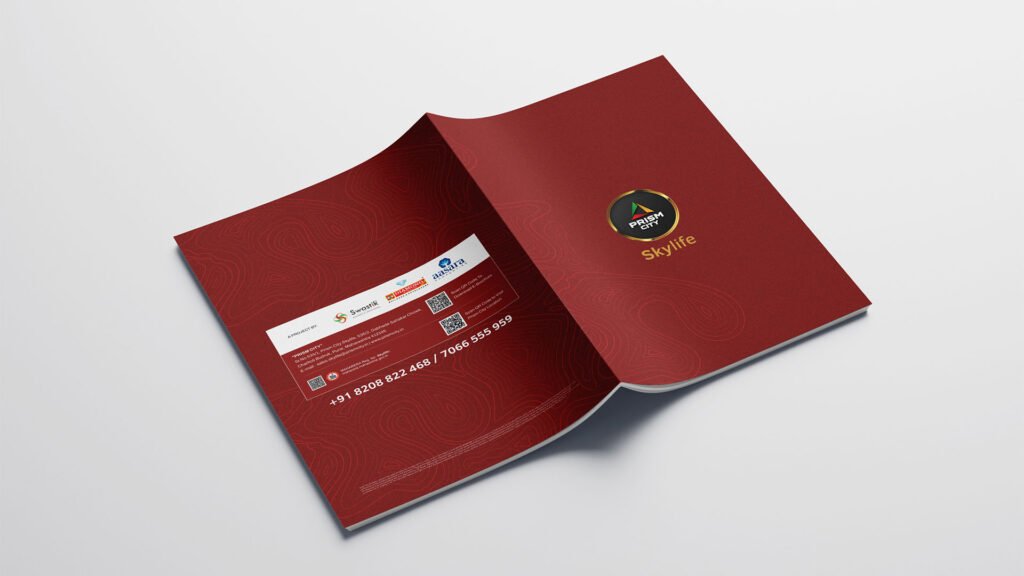
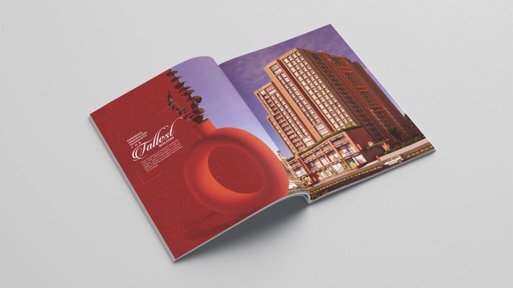
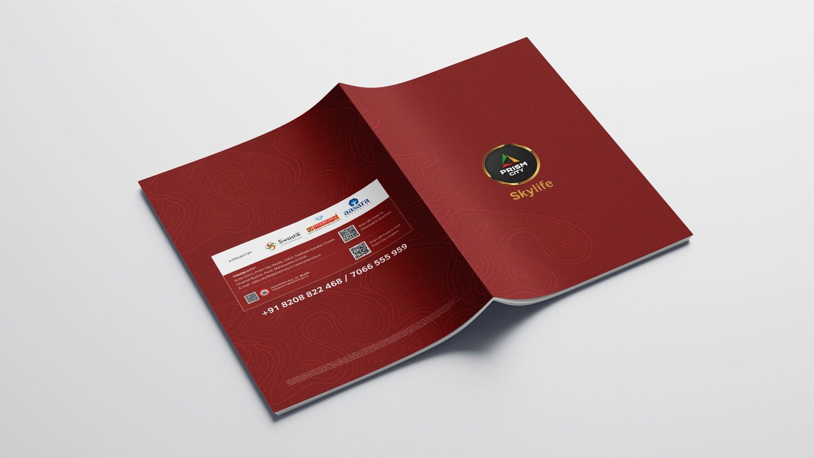
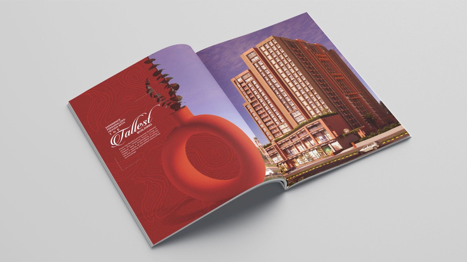
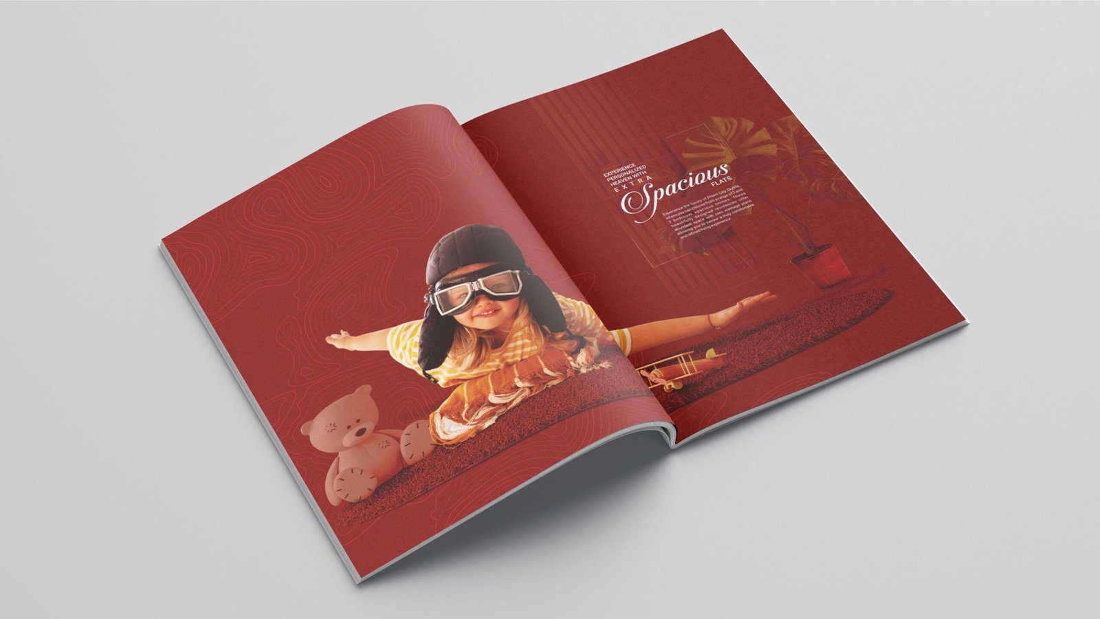
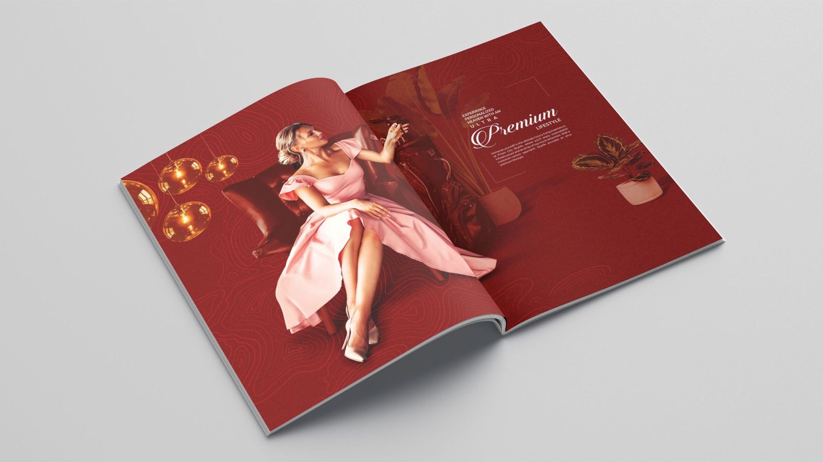
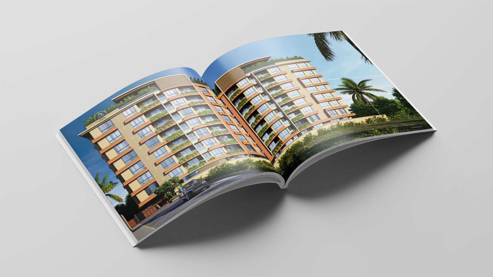
We designed a striking brochure for Charholi’s tallest building, Prism City SkyLife, featuring a premium hardcover finish. The brochure highlights captivating visuals of the project’s top-tier amenities, complemented by engaging and thoughtfully crafted content aimed at capturing attention and driving customer interest.
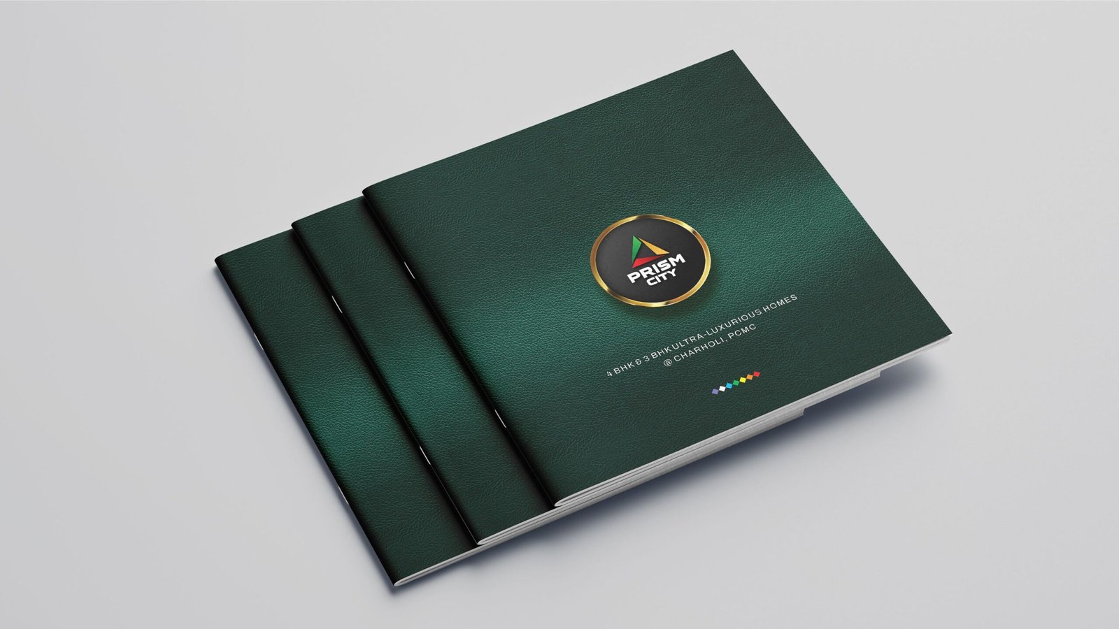
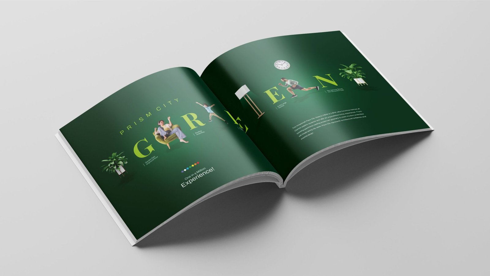
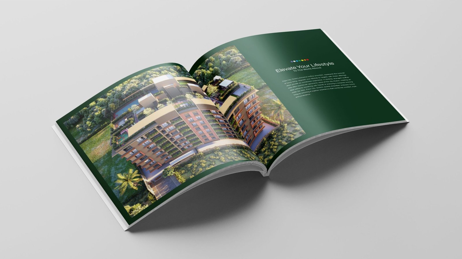
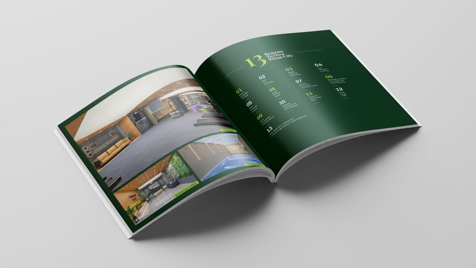
Inspired by the essence of nature, we designed a captivating brochure for ‘Prism City Green’. With a refreshing green palette and stunning visuals, the brochure beautifully reflects the project’s eco-friendly spirit. Engaging content highlights its standout features, drawing readers into a greener way of living.
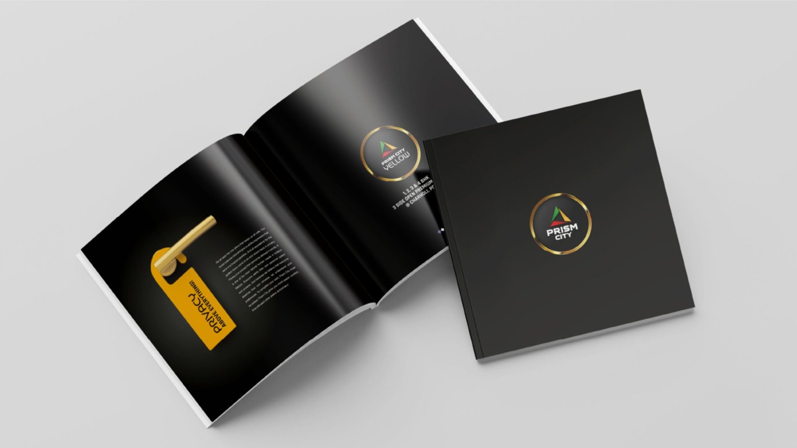
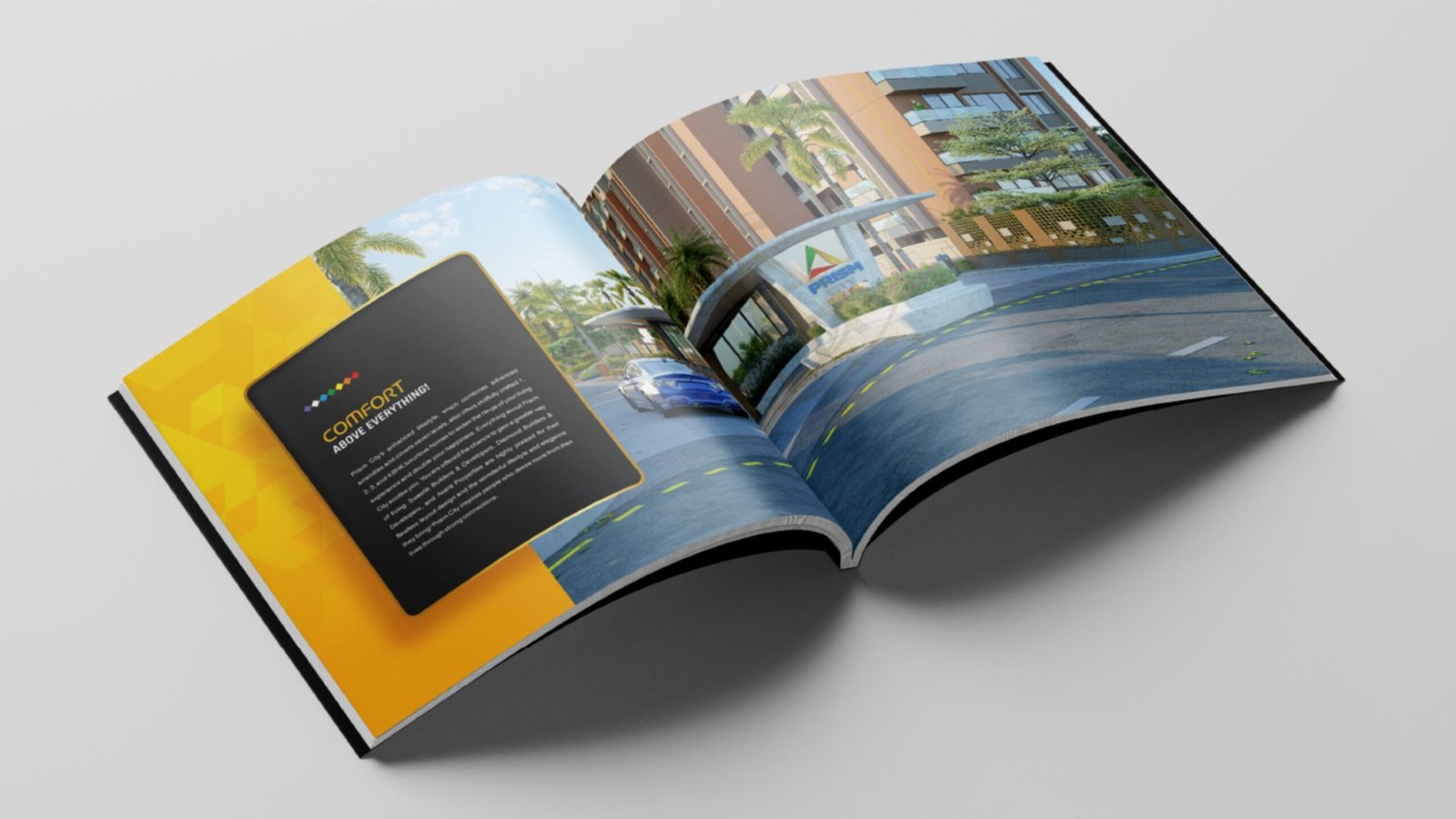
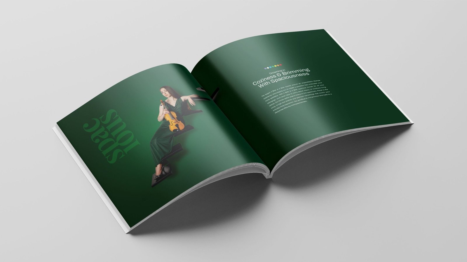
We designed a salient brochure for Prism City Yellow — a project that redefines luxury living with rooftop amenities and elegant homes. The brochure features a vibrant yellow theme, compelling visuals, and well-crafted content that highlights the project’s lifestyle offerings. Every element was thoughtfully created to reflect the brand’s promise of turning dream homes into reality.
Digital Campaign: –
We extended the message of “Yaha Sabke Liye Space Hai” into the digital space through engaging creatives, reels, and relatable storytelling — highlighting how Prism City offers the perfect home for every lifestyle.
The campaign positioned Prism City as a premium real estate project in Charholi, emphasizing its spacious living advantage.
Results that speak:
-27 bookings on launch day — an exceptional milestone
-250–350 leads per month with CPL (Cost Per Lead) reduced from ₹600–800 to just ₹200–288
-Reached 95,000–1.5 lakh targeted users/month
A campaign rooted in emotion, backed by performance.
To bring the concept of “Yaha Sabke Liye Space Hai” to life, we created a heartfelt TVC that reflects the essence of Prism City.
With a warm narrative and relatable visuals, the TVC beautifully reinforces that Prism City isn’t just about homes — it’s about inclusion, emotion, and everyday living.
The campaign extended the message across screens and hearts, reminding audiences that there truly is space for everyone here.
BrandBand Media Pvt. Ltd. is Pune’s leading branding and advertising agency dedicated to crafting impactful brand experiences.
BrandBand Media Pvt. Ltd.
Amogh Heights, Flat No.: 203, 2nd Floor Opp Yes Bank & Ruturang Society, Aranyeshwar Rd, Near TVS Shelar Showroom, Parvati, Pune 411009
info@brandbandmedia.com
Phone: +91 907 502 1409
Tel No: 020-24 46 2151
All Rights Reserved © Brandband Media Pvt. Ltd.
Privacy Policy | Terms & Conditions